
The Hidden Secret Behind the Starbucks Logo You’ve Probably Never Noticed
You’ve seen it a thousand times — that familiar green logo staring back at you from your morning latte. But have you ever stopped to really look at it? The Starbucks siren, as iconic as the coffee itself, holds a fascinating little secret most people never notice.
Before we dive into the details, let’s rewind for a moment.
A Nod to the Sea — and to Moby Dick
The face that greets you from every Starbucks cup isn’t just a pretty design — she’s a siren, a mythical creature from the sea. Sirens were known for luring sailors with their enchanting songs, and that imagery ties beautifully to the idea of an irresistible cup of coffee.
Even the name Starbucks nods to the ocean — it was inspired by Starbuck, the first mate in Herman Melville’s classic novel Moby Dick. The founders wanted a name that evoked both adventure and the romance of the sea.
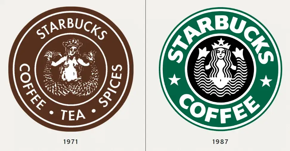
How the Starbucks Logo Evolved
The Starbucks logo has gone through quite the transformation over the years.
- 1971: The first logo featured a brown, two-tailed siren surrounded by the words Starbucks Coffee, Tea, and Spices.
- 1987: The brand switched to its now-famous green hue, representing growth, freshness, and prosperity.
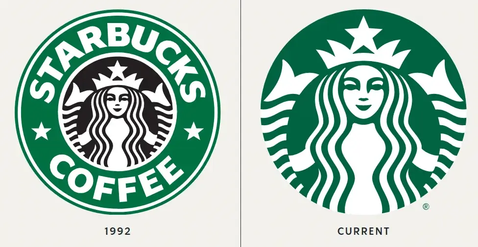
- 1992: Starbucks went public, and the siren received a sleek, modern redesign — a simpler, more refined look.
- 2011: The biggest change of all — the words “Starbucks Coffee” disappeared entirely. The siren took center stage, symbolizing a brand so recognizable it no longer needed to say its name.
But even after all these updates, the logo still holds one subtle secret that most people never spot.
The Siren’s Secret: Imperfectly Perfect
Take a closer look the next time you’re holding that cup. At first glance, the siren’s face appears perfectly symmetrical — serene and balanced. But if you look carefully, you’ll see something intriguing:
- Her right side is slightly darker, with a subtle shadow.
- Her nose tilts just a bit to the right.
- And her right eye is faintly obscured, hiding in that delicate shadow.
This wasn’t a design flaw — it was intentional.
The Starbucks design team believed that true perfection felt too cold and mechanical. By giving the siren a touch of asymmetry, they made her feel more human, more approachable, and more real.
It’s a small detail, but one that captures the very essence of the brand — warmth, authenticity, and a sense of connection.
A Symbol That Sings
From her mythological roots to her subtle imperfections, the Starbucks siren tells a story that goes far beyond coffee. She’s a symbol of transformation — from sea to shore, from local roaster to global icon.
So, the next time you take that first sip of your morning brew, pause for a moment. Look down at the siren — and you might just see her differently.
After all, perfection isn’t what makes something memorable. It’s the little details that make it human.
You’ve just read,The Hidden Secret Behind the Starbucks Logo. Why not read Manager Had To Hire A New Employee.