Logo Evolution Of Famous Brands
A brand relies on it’s logo to be recognisable and remember-able. I am sure we are all very familiar with the brands you are about to see below, but how many of you can remember the old logo and the evolution of the brand that has made it what is is today. It is very interesting to see the growth, and some of these were quite a surprise as we had no idea the original designs looked so different.
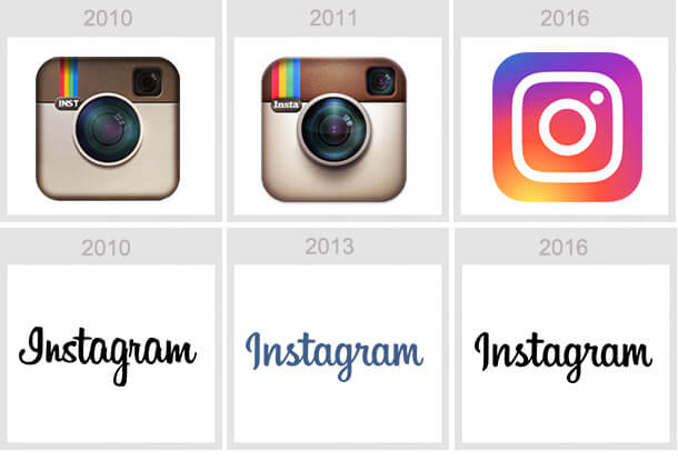
1. This is still a fairly new app so while there isn’t a lot of time gone passed, the design has changed quite dramatically.
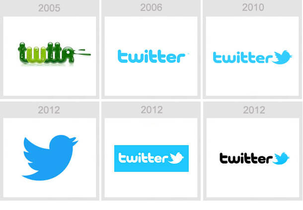
2.We had no idea that the logo in 2005 looked so different, can’t imagine twitter without the logo it is today.
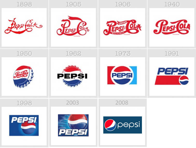
3.We have always known Pepsi with its bold simple font, seeing it with the fancy script font almost seems wrong.
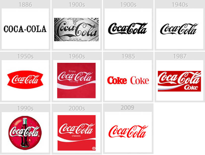
4.Of course coca-cola has been around for a long time, so change is expected over all these years.Who wouldn’t recognise the red that we have all known to associate coca-cola with.
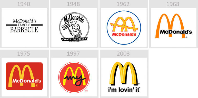
5.Wow this has been a serious glow up! We are definitely Lovin’ it!
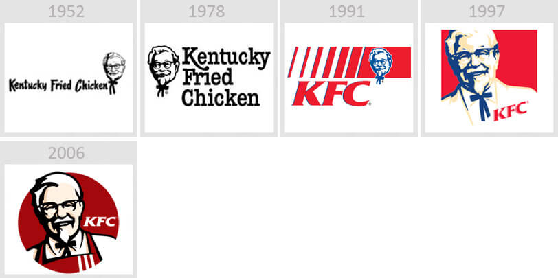
6.Kentucky Fried Chicken has abbreviated and become the KFC we all know and love.
7.We bet as you sip your morning coffee you rarely take notice of the logo, but the subtle differences are there to see.

8.United Parcel Service has been a reliable service for decades, and it’s logo is pretty reliable with very little change over the years.

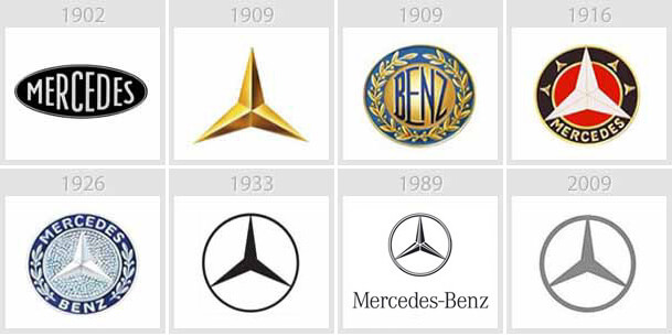
9.One of the most popular car brands, instantly recognisable for the infamous logo.
You’ve just read, Logo Evolution Of Famous Brands. Why not read Manager Had To Hire A New Employee.

